Winefulness
A new type of wine experience
the why and how
Gunnar knows wine. Better than most. He wanted to build a new kind of wine experience around it, and needed everything else around the brand.
Wine people tend to take themselves seriously. Gunnar takes the wine seriously. So no curly serifs, no wine red, and a story behind every detail. Like every bottle he pours.
the what
The Brand
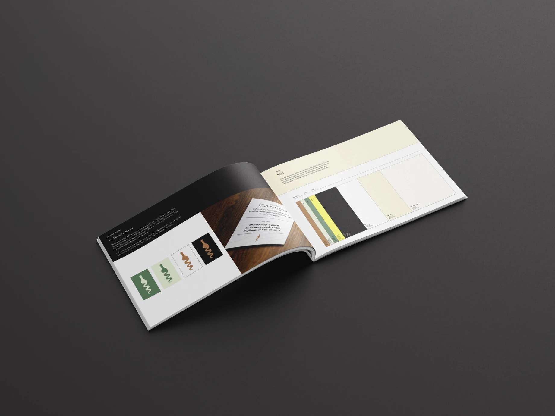
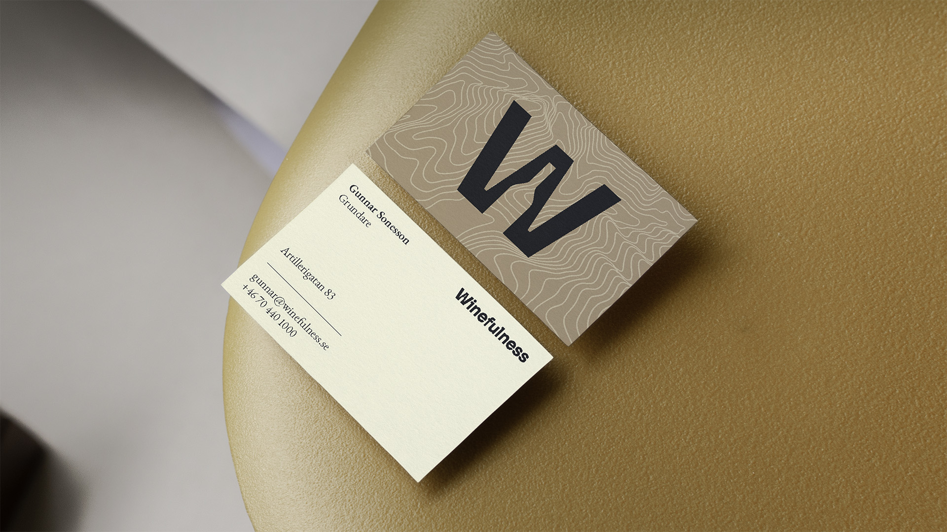
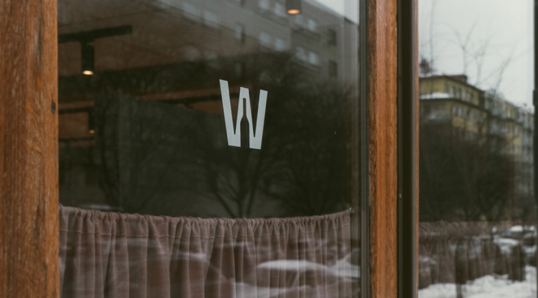
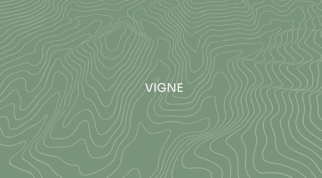
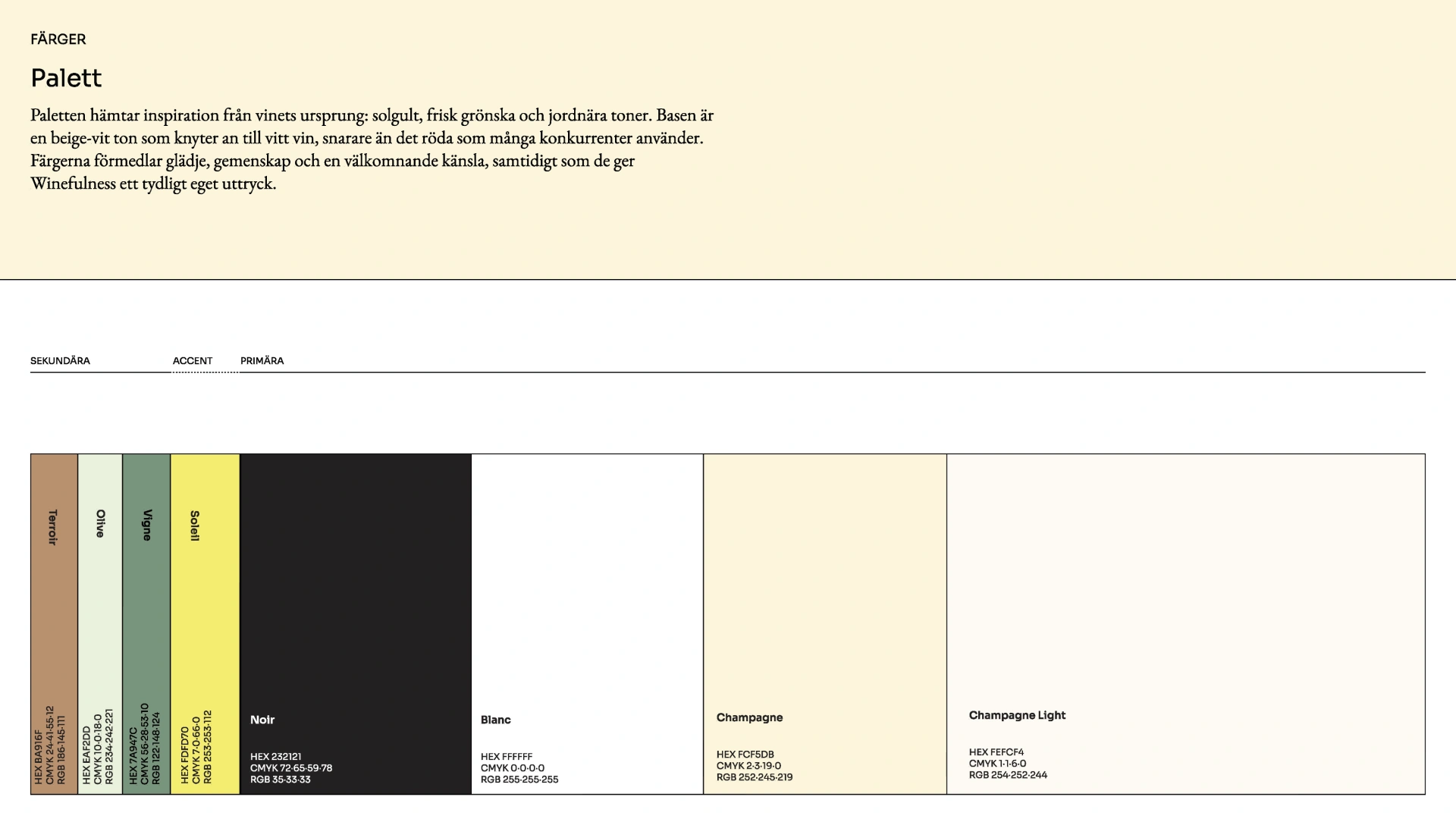
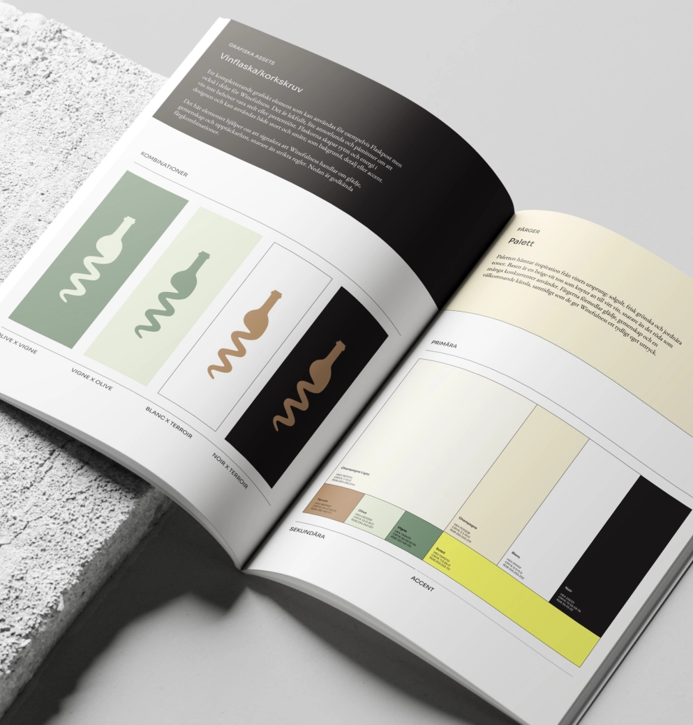
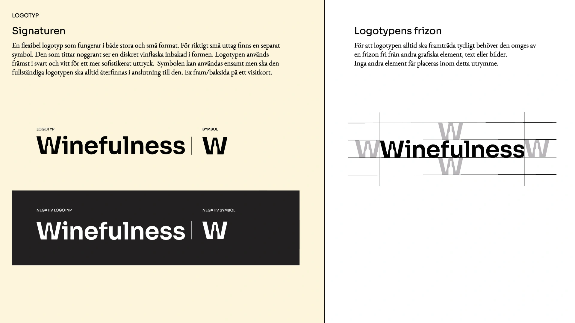
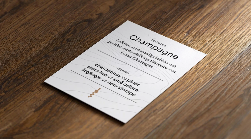
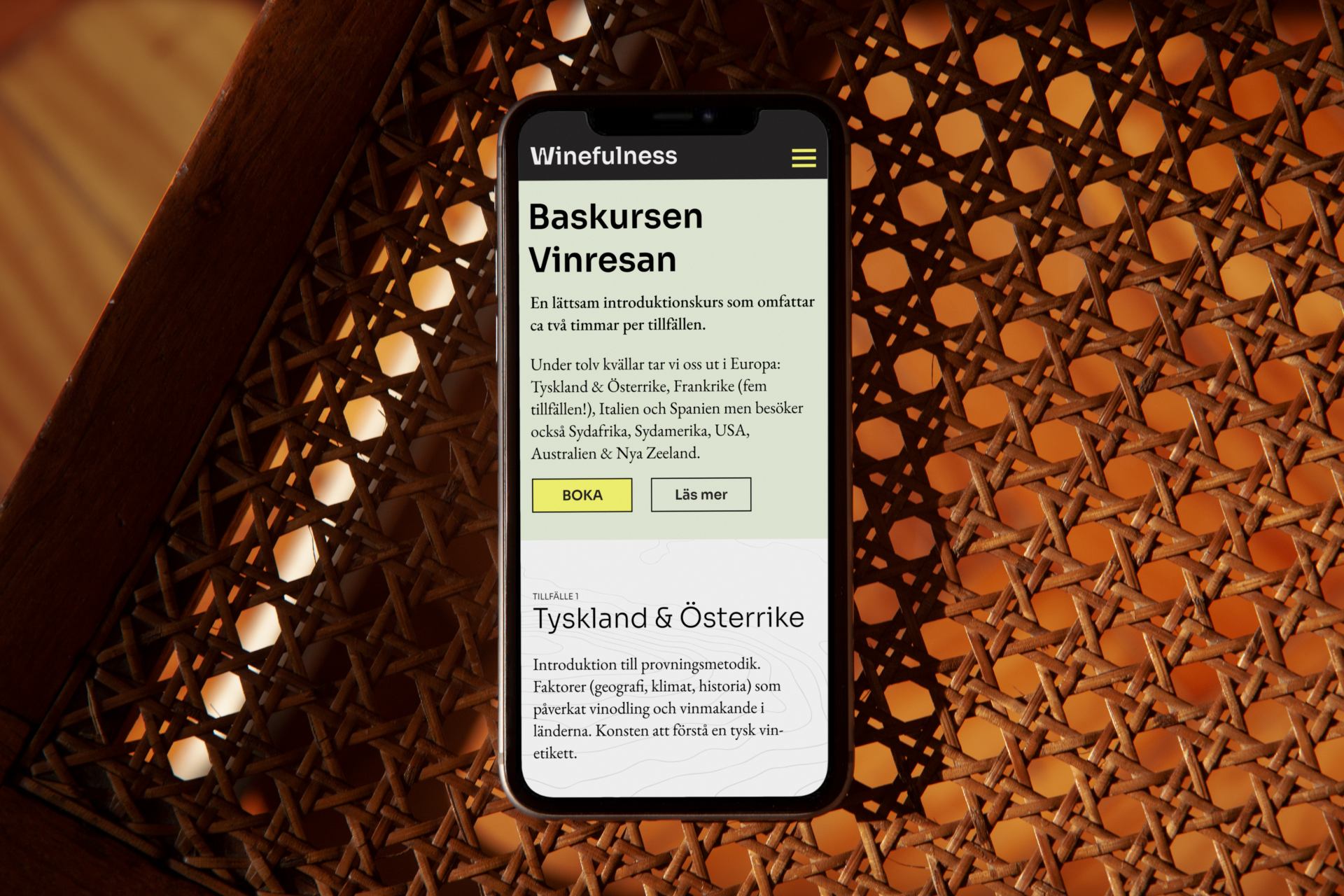
A pattern drawn from the topography of some of the most famous vineyards and districts, so wine country shows up on the menu, the business cards, the newsletter and the front door. A wordmark with a bottle hidden in the negative space of the W. Sora in the headlines, Garamond in the body copy, a classic from the wine labels. A palette of soil, champagne and white wine. All of it in a brand manual, so Gunnar can run it himself.
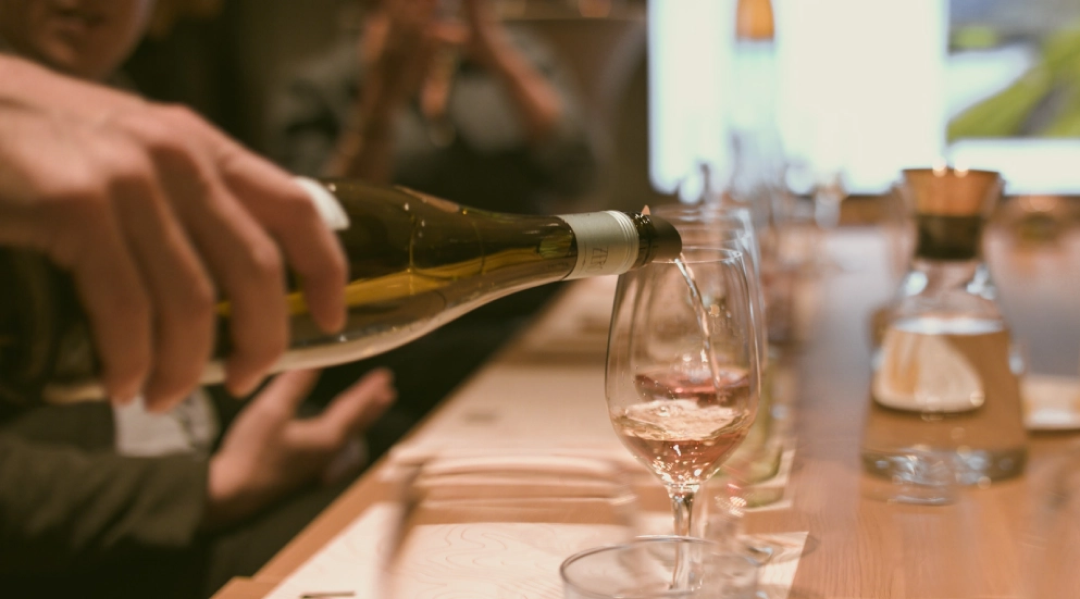
The website
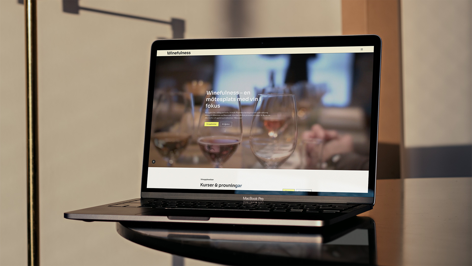
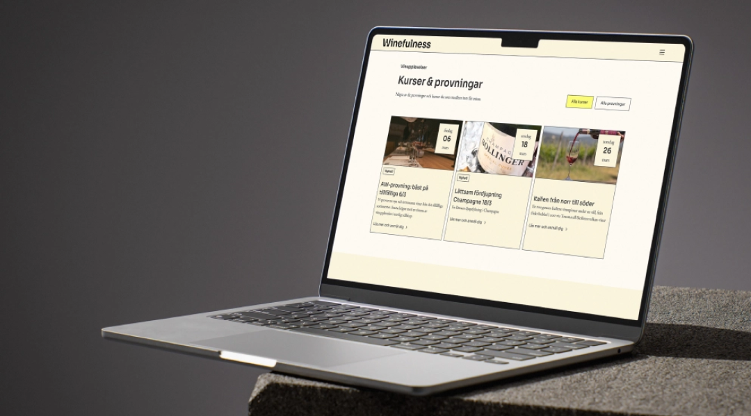
Not a shop with 500 wines. Not a one-pager either. Courses, tastings, dates, filters, memberships, a blog and a newsletter, with sign-ups that land straight with Gunnar. The brand gets room to breathe between the functional parts. And the backend is simple enough that he publishes a new tasting or a wine tip himself.
Who did what
I did this one at Tale as Creative Director, but stayed hands-on the whole way, from the first sketches to the final files. Designer Emelie Holmblad was right there with me, and between the two of us we built all of it.
want some more?